Intricate Group
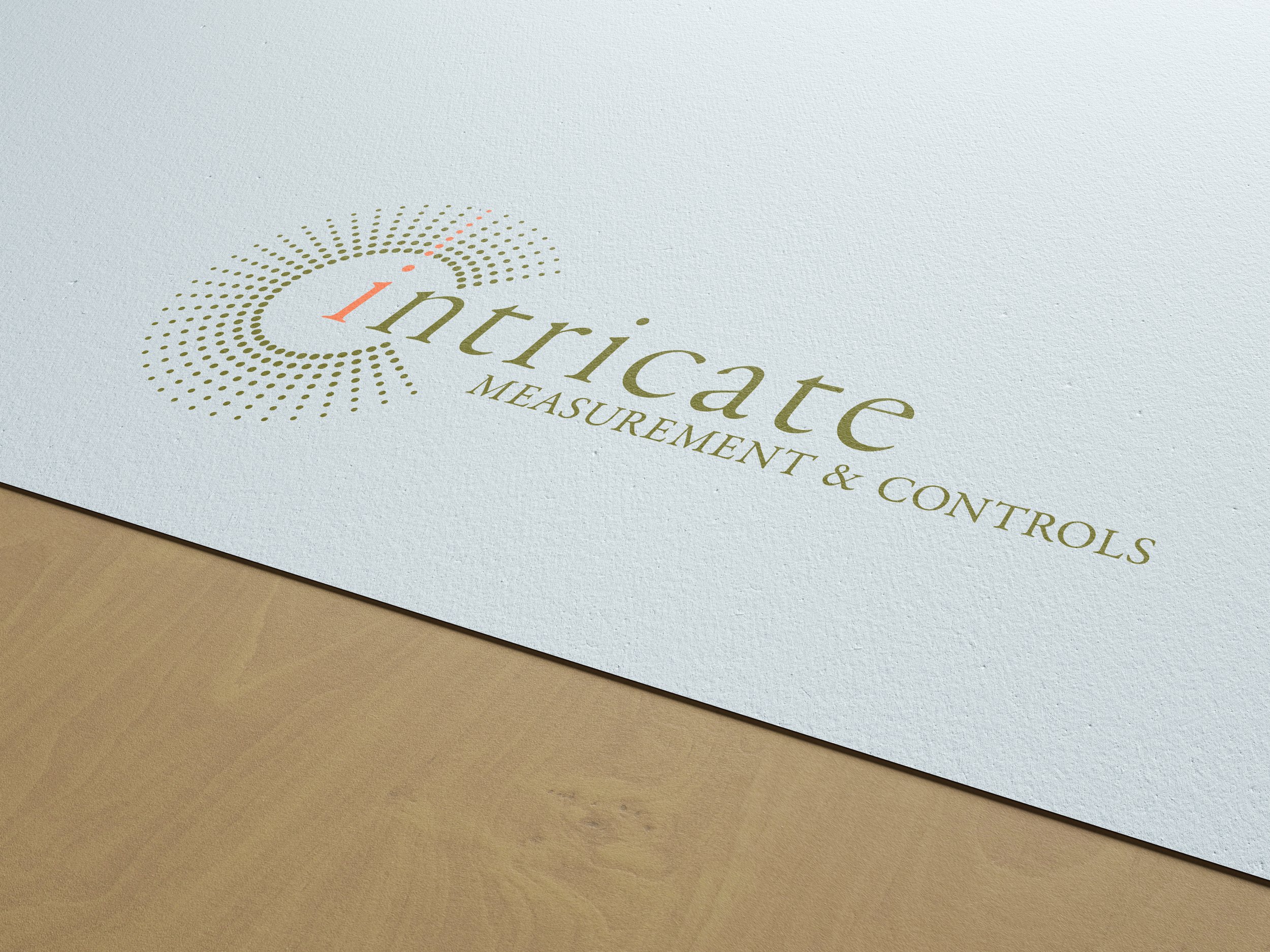
Intricate was a startup when they came to us to create their logo. They were starting from the ground up as a multi-disciplined oil field services company. They choose the name to convey service, attention to detail, and a wide range of services. Our task was to create a memorable logo that conveyed these core elements of the company.
A large part of the Intricate Groups services involve measurement and controls both upstream and downstream of oil and gas production. The icon we created is about precision and attention to detail. We designed the icon to be a part of the entire logo representing the connection to core values. The colour palette was chosen to set Intricate apart from competitors as these colors are traditional in the industry.
WHAT WE DID
Logo
Font and colour palette
Stationery design
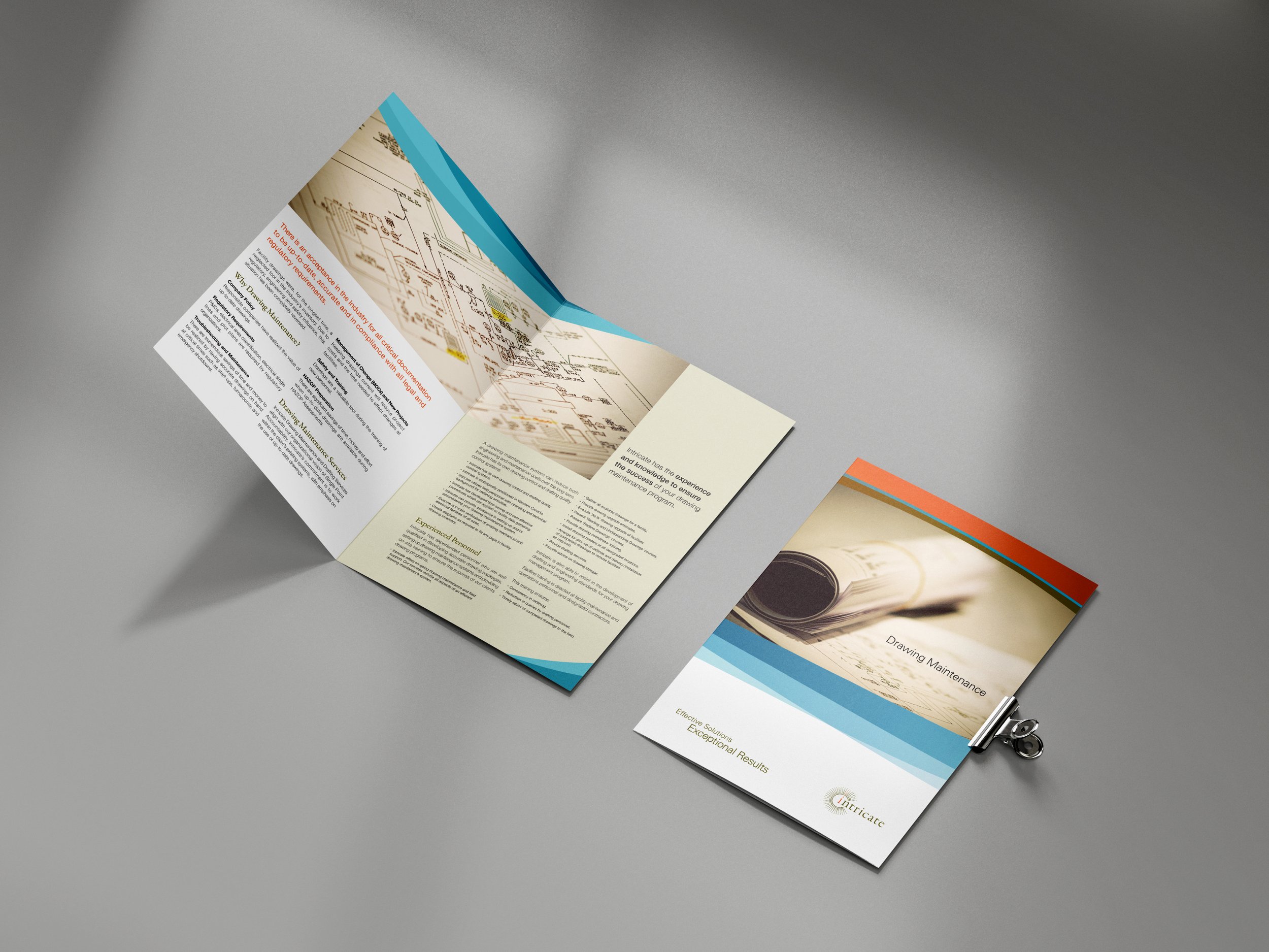
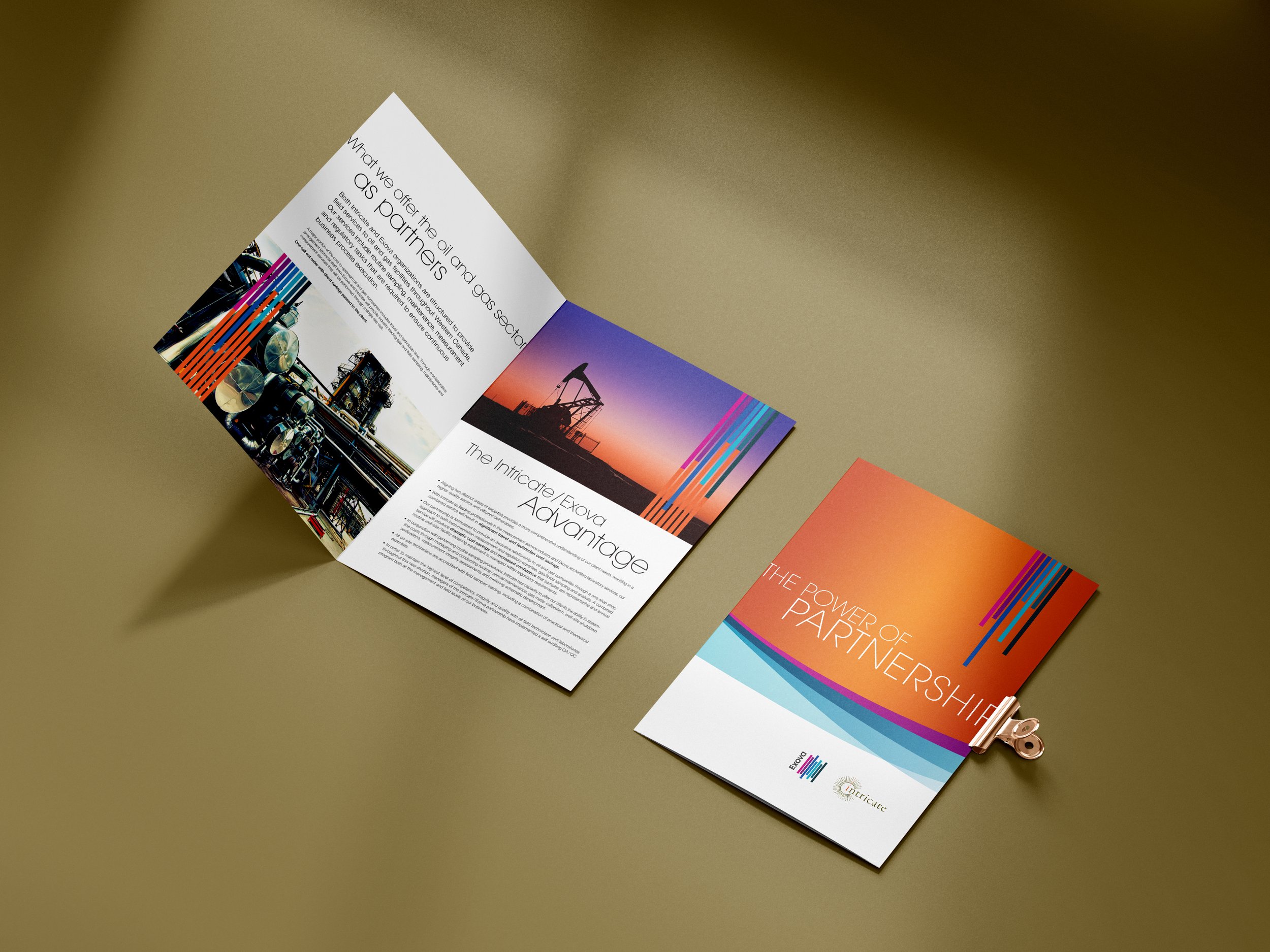
Marketing brochures and folder
Trade Show display
Print ads
"We have had a great working relationship with Spindrift Design for many years. They worked closely with us at our startup phase, from designing our logo and producing all of our marketing materials. Spindrift Design was a key partner in building a brand identity for us that has stood the test of time.”
Greg Howell, President, The Intricate Group


