5 Big Rebrands in 2023
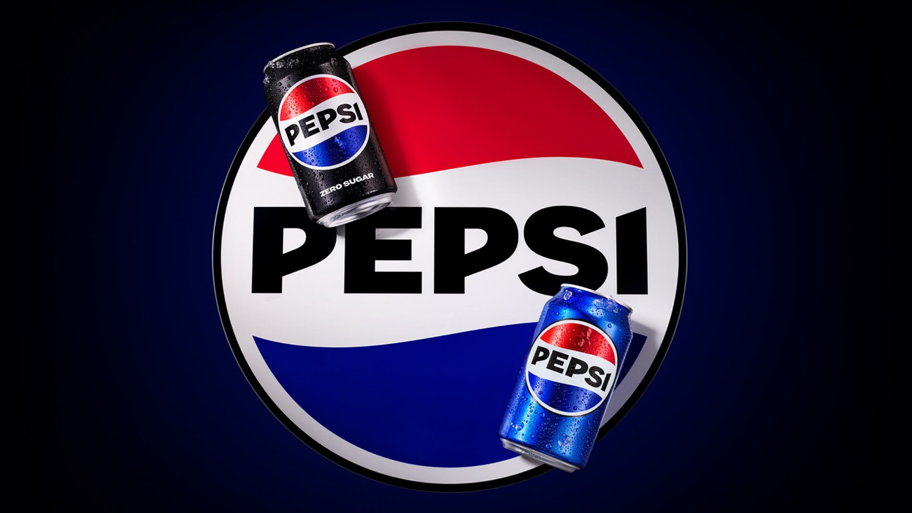
Image credit: Pepsico
Pepsi
Pepsi's 2023 rebrand was a strategic leap into contemporary aesthetics. The globally recognized logo underwent a dynamic transformation, with the use of vivid gradients that symbolize the brand's forward-thinking and innovative approach. The sleek redesign extended to packaging, featuring modern graphics and typography, reflecting Pepsi's commitment to staying culturally relevant. The new look highlights the brand's ability to seamlessly blend its timeless appeal with a fresh, modern perspective.

Image credit: Bolt
Bolt
This new logo for fintech Bolt cleverly uses negative space. The new visual has an appealing bright background color, thick capital letters, and a lightning bolt between its L and T. The brand name and logo aim to represent the speed and efficiency of its checkout process, and the theme of electricity is echoed in the new colour palette with its bright yellow-green.

Photo credit: Coca-Cola Company
Fanta
In 2023, the iconic bubbly beverage embraced a dynamic visual overhaul, featuring bold, playful graphics and an updated logo that exuded energy. The colour palette bursts with lively hues, reflecting the brand's effervescent personality. Fanta's packaging received a modern facelift, enhancing shelf appeal and resonating with a youthful demographic. This strategic reimagining aimed to invigorate Fanta's identity and strengthen its connection with consumers.

Image credit: The Kraft Heinz Company
Jell-O
In 2023, the Jell-O brand evolved with a fresh and high-energy logo, shedding its traditional image for a more vibrant and versatile look. The packaging received a sleek redesign, featuring updated graphics and a playful color palette that reflected Jell-O's fun appeal. Jell-O's bold makeover marked a shift towards modernity, ensuring its continued relevance in the dessert landscape with a visually appealing and enticing new identity while maintaining the nostalgic essence for existing fans.

Lippincott: Nokia (Copyright © Nokia, 2023)
Nokia
In 2023, Nokia unveiled a sleek and minimalist logo, embodying a fusion of innovation and simplicity. The blocky design of the previous logo, which was designed in 1979, was simplified to make it more minimalist and angular with slender characters. With a modernized color palette and contemporary visuals, the rebrand aimed to resonate with a new era of consumers. Beyond aesthetics, Nokia's 2023 rebrand symbolized a strategic pivot, re-establishing itself as a formidable player in the tech industry, evoking nostalgia while showcasing a forward-thinking approach to remain relevant in the rapidly evolving digital landscape.